We introduced our app dashboard in the 21.20 release, and its functionalities are broken down into four categories:
- Inventory of classes, methods, database tables, columns, and foreign keys
- Code complexity score
- Trend line
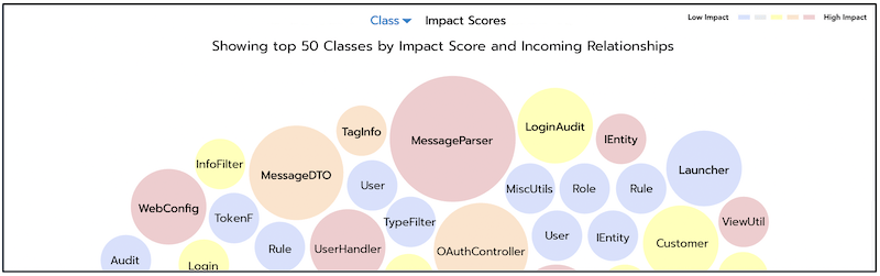
- Class and method analysis
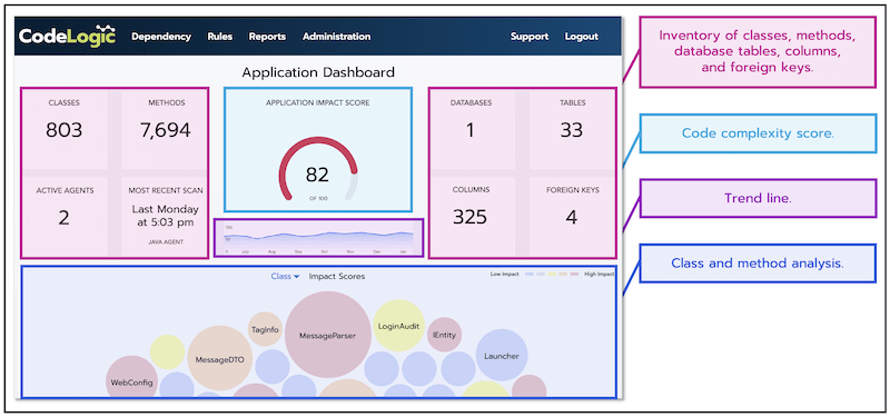
Our dashboard isn’t another item to get lost in developers’ ever-growing toolboxes. It’s an effective way to quickly and simply find elements of code that need refactoring or rewriting. With the new dashboard, teams can view attributes of code that show the relative potential impact between classes or methods, and thus help developers decide what needs addressing and to gradually chip away at their technical debt.
Many applications end up with a range of classes and methods that are longer and/or more complex and aren’t ideal for development best practices. Development teams who are able to invest a limited amount of effort to counter technical debt benefit massively from seeing where problematic code is most heavily utilized and can be guided on where to first begin working. If concerning code is confined to an obscured corner of the app, the engineer can assign it as a low priority. However, if its leveraged by other components, the developer can make it a higher priority to reach a solution.
The Impact Score trend line will provide the team with a simple discussion starter for technical debt. If it is increasing, the team can discuss whether the urgency of the next set of features demands taking on more technical debt. Do we accept more risk of defect and slower development later or do we slow down a little now in order to clean up? This is always a business decision, but the discussion can be triggered and informed by Impact Score trends.
Our dependency mapping dashboard is the primary source of intelligence to help combat technical debt and give teams clear oversight of their code. In a software space where quantity can sometimes override quality, the dashboard ensures code (both new and legacy) is maintained, ultimately saving organizations time, money, and reputation.